App design playbook · 10 patterns · 14 min read
10 app UI patterns users understand instantly
Study 10 of the best mobile app UI patterns, with annotated examples, practical rules and AI prompts for designing a clearer first version.
1. The one-job home screen
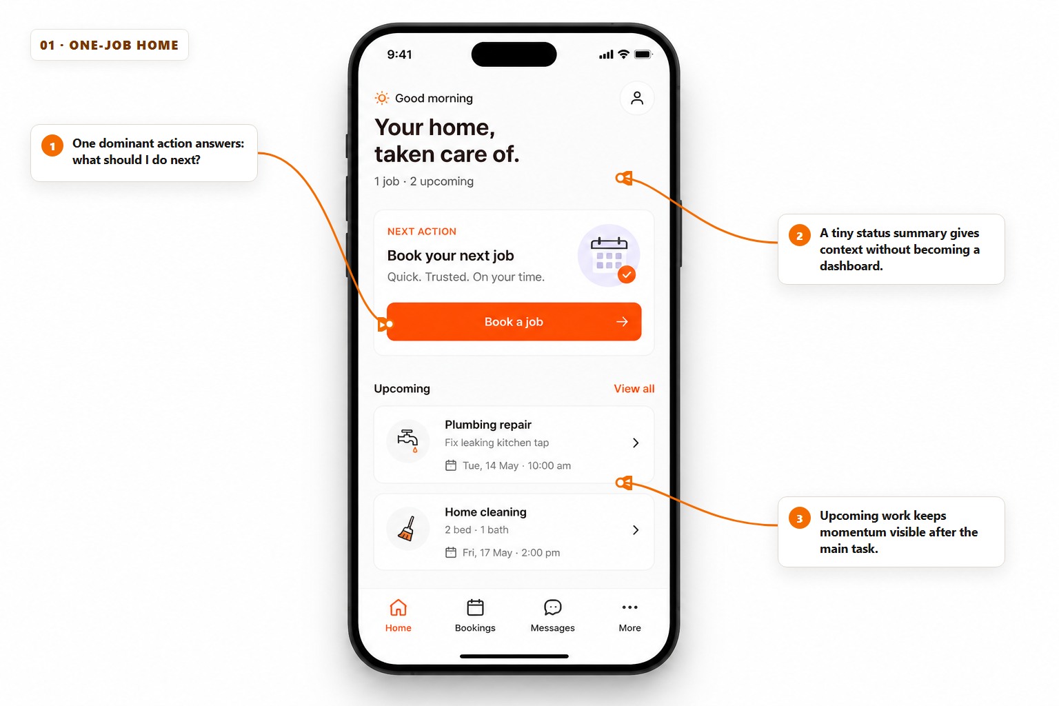
The strongest home screen is often not a dashboard. It is a decision: what is the one useful thing a returning user most likely came to do? Put that action above every secondary destination and use the rest of the screen to answer only the questions needed before it is pressed.
The example makes Book a job visually dominant, then uses a tiny status line and two upcoming items to provide reassurance. It does not show testimonials, six promotions or every service category. Those may matter elsewhere; on this screen they would compete with the job the product exists to finish.
- Use one primary button label that describes the outcome, not a vague word such as Continue.
- Show only the context that changes the next decision: status, availability or the next scheduled item.
- Move browsing, history and settings into navigation instead of repeating them as home-screen tiles.
Tip. If three actions feel equally important, the product probably has three different user moments. Design a different home state for each moment instead of making every action shout.
2. The command-centre dashboard
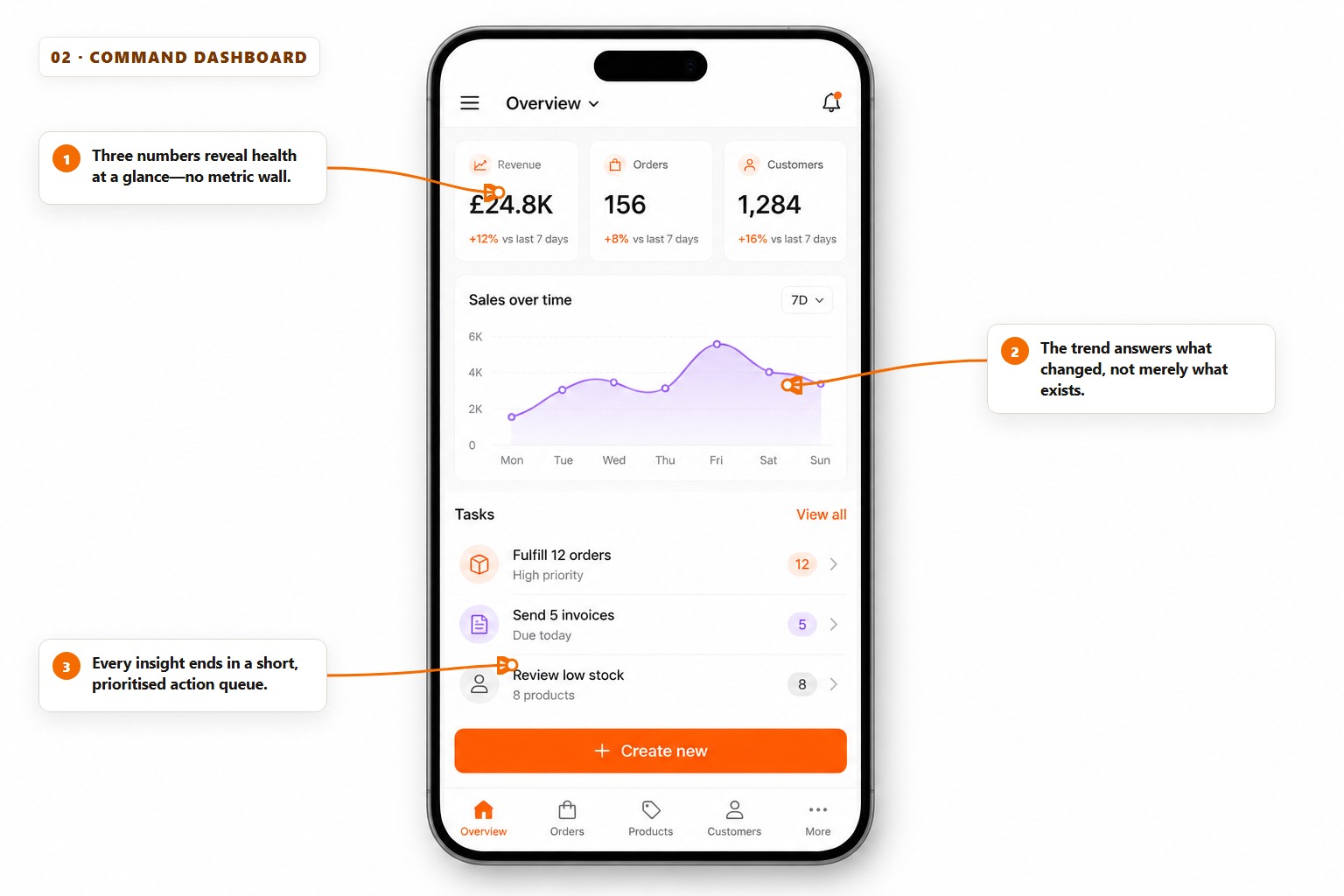
A dashboard earns its space when the numbers change a decision. Start with the three measures that describe health, add one trend that explains direction, then finish with a queue of work created by those facts. This gives the screen a sentence-like order: this is where we are, this is what changed, this is what to do next.
Do not confuse visibility with usefulness. Twelve equal metric cards force the user to decide which numbers matter before they can use the product. Prioritisation is part of the interface, not a task to delegate back to the customer.
The dashboard test
- Metric
- Can the user say what healthy looks like?
- Trend
- Can they see whether the situation improved or worsened?
- Action
- Does the screen make the next useful move obvious?
Note. A metric that never changes a decision belongs in a report, not on the home screen.
3. Predictable bottom navigation
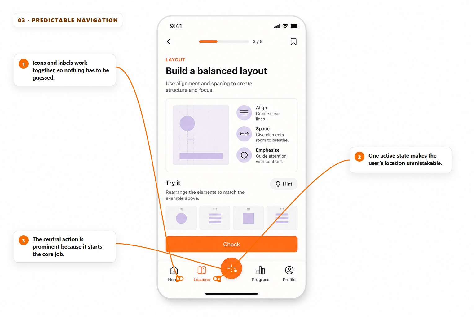
Bottom navigation works because it keeps frequent destinations inside the thumb zone and leaves them visible while the screen changes. Its power comes from consistency. The order, wording and icons should not shift between pages, and the active destination should be obvious without relying on colour alone.
Pair icons with short labels. Familiar symbols are not universal, and an unexplained sparkle, grid or bolt can mean almost anything. If the app has one creation action used from several destinations, a central action may be stronger—but it must do one stable job everywhere it appears.
- Keep the bar to three, four or five destinations; move rare destinations into More or Settings.
- Use destination nouns such as Home, Bookings and Progress rather than commands that change meaning by screen.
- Preserve the selected tab and scroll position when a user briefly visits another destination.
Tip. Do not hide navigation while a user is still learning the product. Saving 64 pixels is rarely worth making the app feel like a maze.
4. Search-first discovery
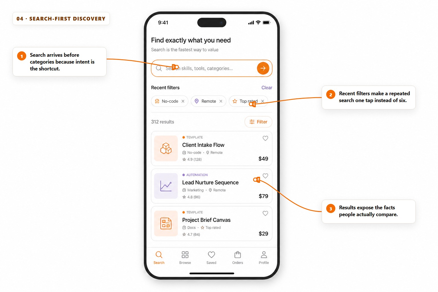
When people can name what they want, search is the shortest path to value. Place it before category decoration, accept natural wording and help users recover from imperfect queries. Recent filters and useful suggestions reduce the cost of returning to a task without taking control away from the searcher.
The result card should answer the comparison questions before the detail page: what is it, who or what is it for, can I use it now, what does it cost and why should I trust it? Hiding those facts creates clicks, but not useful progress.
- Show the user’s exact query after results load.
- Offer filters based on real decision criteria, not the fields easiest to store.
- Explain an empty result and provide one recovery action: remove a filter, broaden the area or try a suggested phrase.
Note. Search quality is an interface feature. A beautiful field cannot rescue vague indexing, missing synonyms or an empty state that simply says No results.
5. The card marketplace
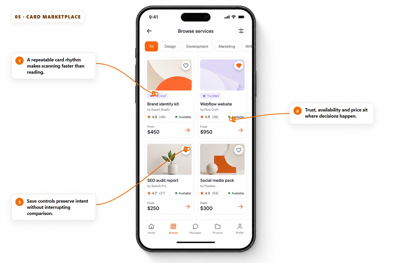
Cards are useful when every item can be described with the same small set of facts. A repeated hierarchy lets the eye learn the pattern once, then compare quickly: image, name, trust, availability and price in the same position each time.
Cards fail when they become miniature detail pages. Do not squeeze every feature, badge and action into the grid. Pick the facts that decide whether someone should open the item, and let the next screen carry the full description.
- Keep image ratios, title lines and metadata positions consistent across the grid.
- Reserve badges for information that changes a decision, such as unavailable, verified or new.
- Make saving reversible and immediate; do not force an account prompt before showing that the tap worked.
Tip. Test the grid with the longest real title, the missing-image state and the lowest-quality user content—not only the perfect sample card.
6. The step-by-step booking flow
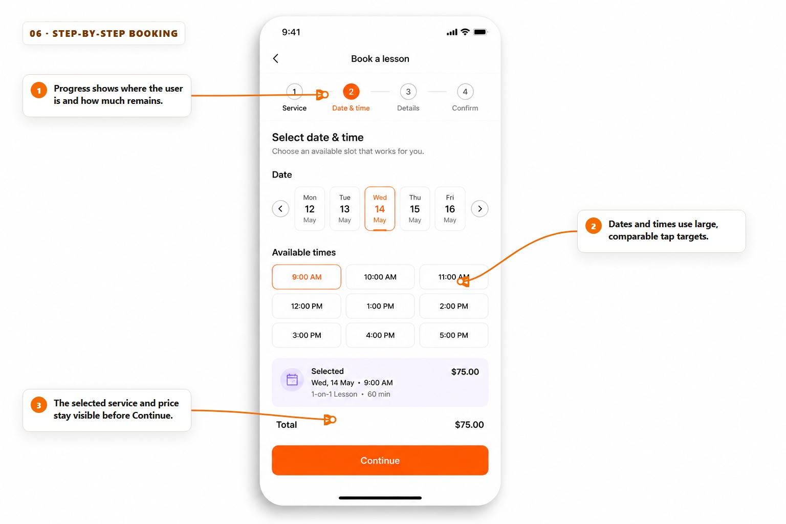
A step-by-step flow protects attention by asking for one kind of decision at a time. Show the user where they are, what remains and whether moving backwards will preserve their work. The sequence should follow the user’s thinking, not the order of fields in a database.
Keep the running summary close to the action. Before Continue, the example repeats the selected date, time, service and total so the user can catch a mistake without navigating backwards. This small receipt prevents uncertainty from accumulating across the flow.
- Start with the decision most likely to disqualify the journey, such as availability or location.
- Ask only for information needed at that step; delay account creation until the value is understood.
- End with a confirmation that repeats the commitment and explains what happens next.
Note. A progress indicator is a promise. Do not show four steps and then reveal three more after payment details.
7. The conversational workspace
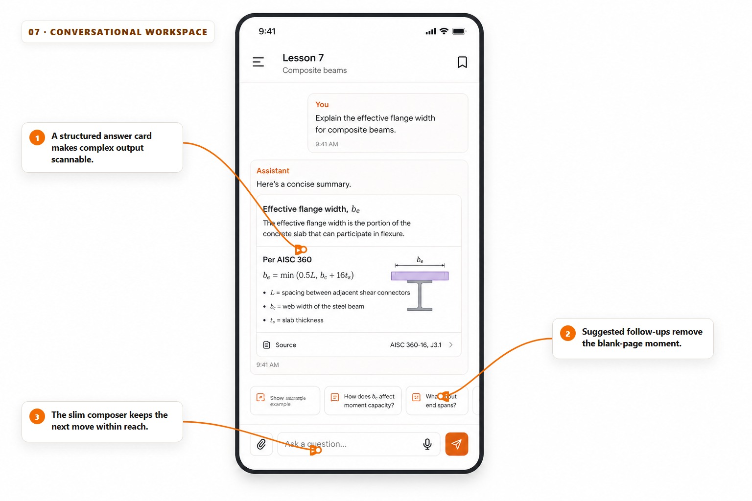
A useful conversational interface is more than alternating speech bubbles. Long or structured output should become a readable artifact: a summary card, checklist, comparison or preview. The conversation supplies context; the artifact makes the result usable.
Suggested follow-ups help when they are specific to the answer just given. Generic chips such as Tell me more add visual weight without reducing thought. Keep the composer slim, preserve the user’s draft and make attachments, voice and send states understandable before they are tapped.
- Separate instructions, sources and final outputs with hierarchy rather than chat-bubble colour alone.
- Show a clear thinking, tool-use or error state without exposing raw internal messages.
- Let users copy, revise or act on the result without retyping it into another screen.
Tip. If a response is important enough to keep, give it a durable card, file or saved result. A chat transcript should not be the only database.
8. The progress and habit loop
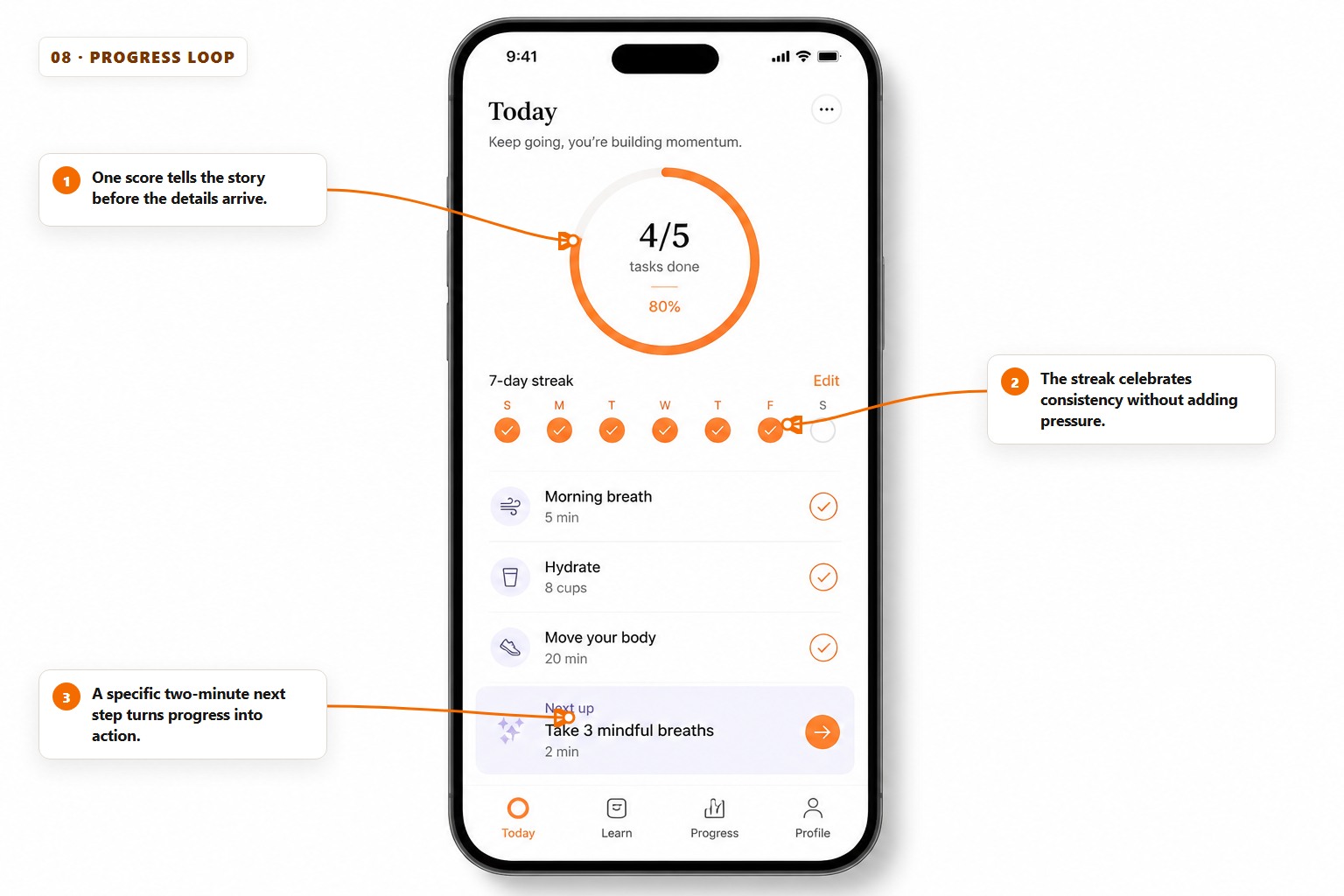
Progress interfaces should answer three questions in order: how am I doing, what have I already done and what is the smallest useful action now? A single score or ring creates orientation, while the activity list explains the score and keeps it honest.
Use streaks carefully. They can celebrate consistency, but harsh loss states turn one missed day into a reason to abandon the product. Prefer language that protects momentum, allows recovery and rewards useful behaviour rather than compulsive opening.
Make progress trustworthy
- Definition
- Say exactly what the percentage measures.
- Evidence
- Show the actions that changed it.
- Next move
- Offer one achievable action, not a motivational slogan.
Note. Never manufacture urgency with a streak that can only be protected by paying, inviting friends or enabling unnecessary notifications.
9. The activity timeline
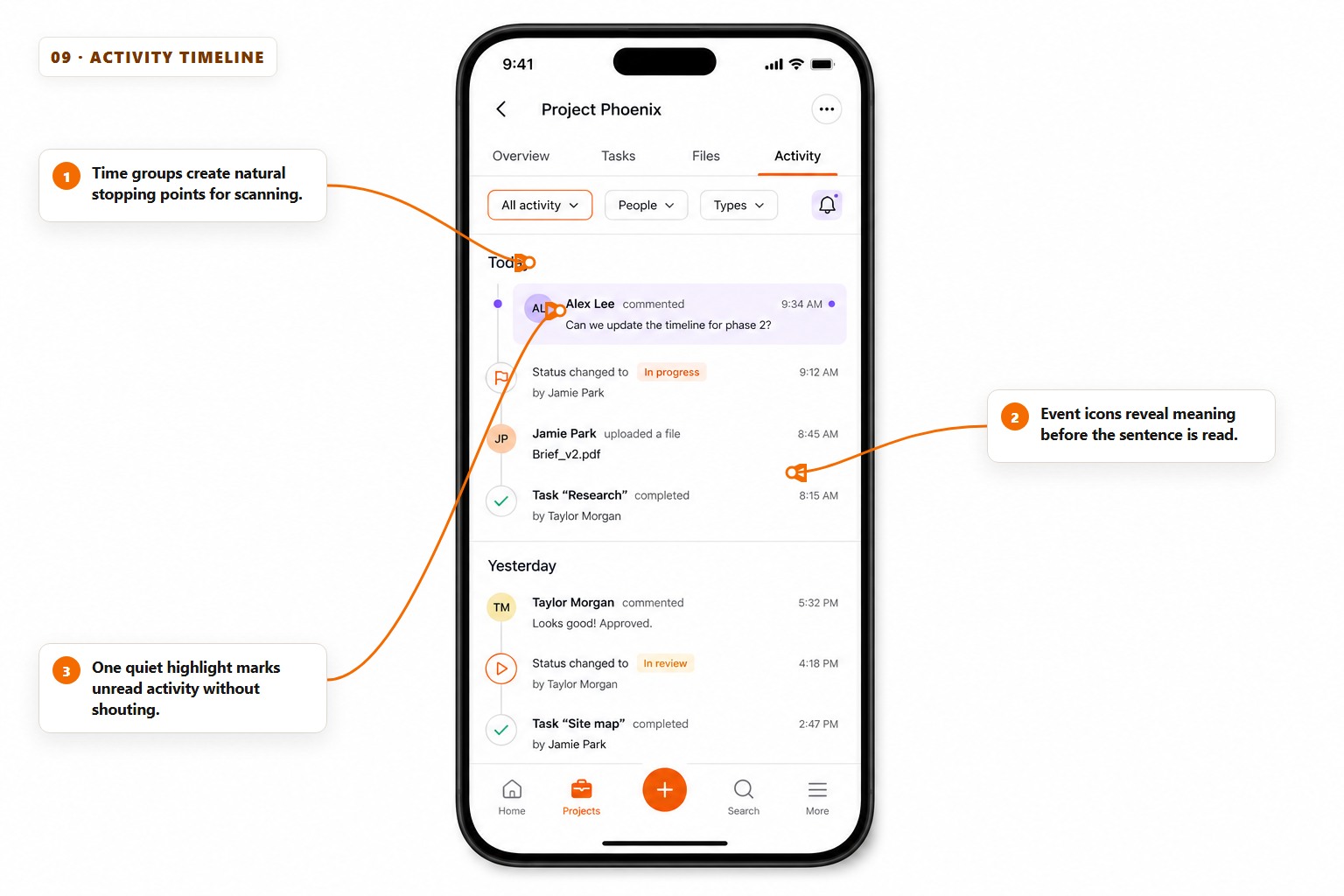
A timeline turns many small system events into a story. Group entries by meaningful time periods, lead with a recognisable event type and keep actor, action, object and time in a stable order. The reader should be able to scan the left edge and understand the shape before reading every sentence.
Do not give every event equal visual weight. A comment that needs a reply, a failed payment and an automatic sync are different kinds of attention. Filters, unread states and severity cues should help the user find responsibility—not merely make the feed colourful.
- Write events in plain language: Sam approved Quote 104 is better than Status changed.
- Link the object named in the event so the timeline remains a route to action.
- Combine noisy repeated automation into one expandable event when no decision is required.
Tip. Keep an audit trail immutable where trust matters. Editing the display is fine; silently rewriting the underlying history is not.
10. Settings that explain themselves
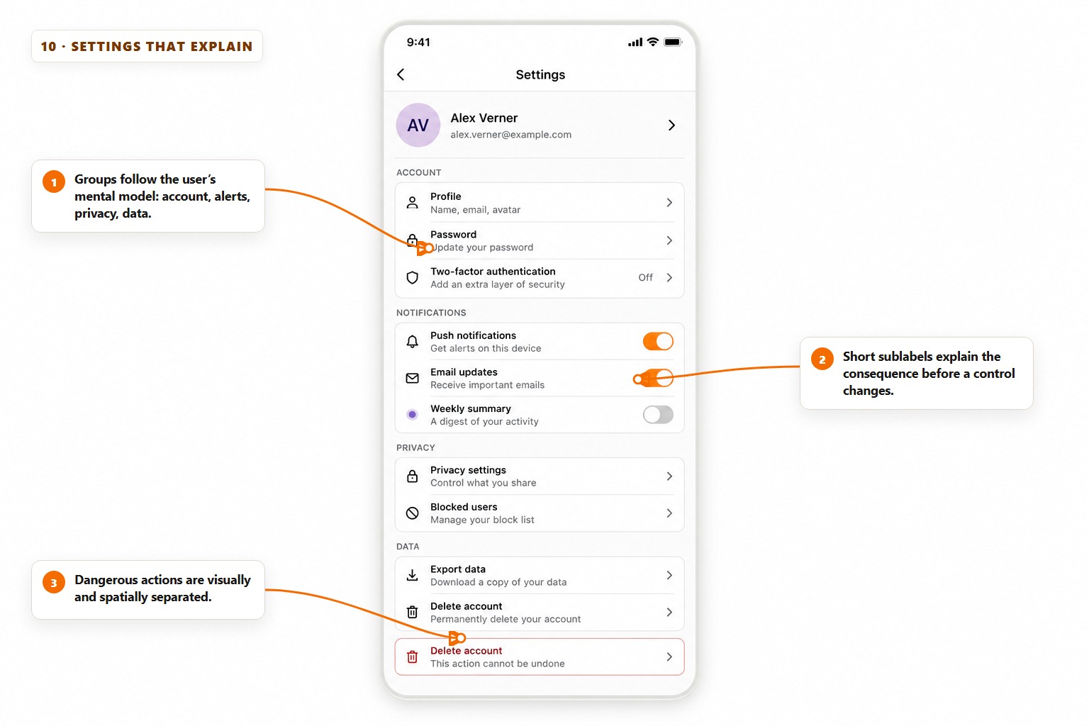
Settings should be organised around the words users already have in mind: account, notifications, privacy, billing and data. Add a short consequence beneath any control whose label is not enough. Push notifications tells a user what changes; Get alerts on this device tells them what it means.
Separate destructive actions from routine controls and require confirmation that names the consequence. Export should come before delete. If an option is unavailable because of a plan, device or permission, explain the reason at the control instead of letting the tap fail later.
- Group by user intent, not internal team ownership or database tables.
- Use switches only for immediate binary changes; use a row with a chevron when another decision follows.
- Show the current value for language, plan, privacy level and connected services before the row opens.
Note. A trustworthy settings screen is part of the product promise. Cancellation, export and privacy controls should be as carefully designed as onboarding.
Common questions
- Which mobile app UI pattern should I choose first?
- Choose the pattern that matches the user’s main job. A repeated task suits a one-job home screen, comparison suits cards or search, a fixed sequence suits a step-by-step flow, and monitoring plus decisions suits a dashboard.
- How many screens should an app’s first version have?
- Use the fewest screens needed to complete one valuable journey and show a clear finish. Many useful first versions need only a home screen, the core task flow, confirmation, history and simple settings.
- Does better app UI improve conversions?
- Clear UI can reduce hesitation, mistakes and abandoned tasks. Measure the completed journey rather than button clicks alone: successful bookings, finished onboarding, useful searches or another outcome the app exists to create.
- Can an AI app builder create these interfaces?
- Yes. Give the builder the user, the job, the chosen pattern, required information and finish state. Then test the narrowest complete journey on a phone before adding more destinations or visual polish.
- Do I need Figma before building an app with AI?
- No. A written journey and a clear UI pattern are enough to begin. Use a design tool when detailed collaboration or a reusable design system will save time, not as a compulsory step before learning whether the core flow is useful.